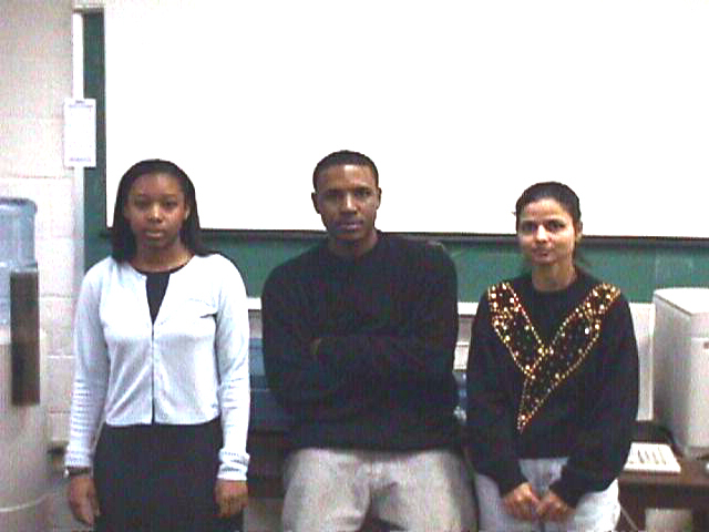
Keisha Harrison, Gary Cordon, and Ravinder Kaur

Scientific visualization is an evolving techology that allows scientist

to understand and interpret the meaning of hundreds of thousands of pieces

of information in a visual form.  Through the use of multi-dimensional,

animated depictions of their data, researchers are able to view previously

unobservable information. Many sciences are best explained using

visualization to illustrate a concept.


Scientific Visualization helps the researcher to solve problems and to

explain a particular concept to the general public.  Visualization

requires that the researcher interpret data and present it in a form that

the general audience may understand.


Scientific Visualization helps present ordinarilly abstrat data in a new

and innovative way.  By using these techniques, more information is made

accessible, therefore improving general comprehension of the task

at hand and giving a new perspective to the problem.


The Visualization team has been learning these techniques by using the

infrared image data in GVAR (GOES VARiable) format.  This information is

collected from the Geostationary Operational Environmental Satellite, or,

more simply "GOES 8", using a satellite dish.  The Visualization team here at

ECSU will be using these techniques for the use of storm tracking.


The weather satellite images that you see on the broadcast TV news each day

(or, if you have cable TV, on The Weather Channel) are created from data

that is transmitted by the GOES Satellite.  THe GVAR system was designed to

allow students from elementary to the college level to view this data.  The

GVAR system collects all of the data from the GOES satellite and converts it

into a form that can be viewed and interpreted by the students.


Getting the GVAR system to work here at ECSU was no easy task. The visualiztion

team had to first install the satellite dish on the roof.  Then install

all of the software, and configure the hardware.


